 Open Access Article
A human-in-the-loop approach for visual clustering of overlapping materials science data†
Satyanarayana
Bonakala‡
a,
Michael
Aupetit‡
 b,
Halima
Bensmail
b and
Fedwa
El-Mellouhi
 *a
*a
aQatar Environment and Energy Institute, Hamad Bin Khalifa University, PO Box 34110, Doha, Qatar. E-mail: felmellouhi@hbku.edu.qa
bQatar Computing Research Institute, Hamad Bin Khalifa University, Doha, Qatar
First published on 2nd February 2024
Abstract
Data-to-knowledge has started to reveal significant promise in materials science. Still, some classes of materials, such as Metal–Organic Frameworks (MOFs), possess multi-dimensional interrelated physicochemical properties that pose challenges in using data clustering methods. We considered an in-house generated database of MOFs consisting of geometrical (pore size and dimensions), chemical (atomic charge of the framework), and adsorption properties (CO2 uptake, heat of adsorption) to evaluate the challenges and limitations of various clustering techniques and propose a solution based on visual clustering. As a starting step, we examined data via principal component analysis (PCA) to understand the interrelationships among a set of dimensions without prior knowledge. This dimensionality reduction method was unsuccessful in visually discovering clusters of MOFs. Then, we tested two combinations of data projection and clustering methods: T-distributed stochastic neighbour embedding (t-SNE) and Density-Based Spatial Clustering of Applications with Noise (DBSCAN) on the original dimension input data (t-SNE//DBSCAN), and Hierarchical Density-Based Spatial Clustering of Applications with Noise (HDBSCAN) clustering the 2D embedding data obtained from Uniform Manifold Approximation and Projection (UMAP) (UMAP → HDBSCAN). Both the t-SNE//DBSCAN and UMAP → HDBSCAN pipelines are found to have overlapped clusters, which lack reproducibility and are parameter-sensitive. In contrast, we relied on a Gaussian mixture model (GMM) that uses the eigenvalue decomposition discriminant analysis (EDDA) method. This method is stable and not strongly dependent on the prior definition of the hyperparameters. We propose a novel interactive divide-and-conquer approach, the combination of GMM-EDDA and a form of linear discriminant analysis to enable visual split or merge decisions for each pair of Gaussian clusters. The end-user engages in the clustering process using trustworthy visualization where clusters appear as separated only if they are also well separated in the data space. Further, the identified meta-clusters were characterized using correlation heatmaps and violin plots of their distribution along each data dimension. Our methodology paves the way to address the clustering and data visualization challenges of highly overlapped and correlated databases.
1 Introduction
Metal–organic frameworks have been serving for the last three decades as potential candidates to offer solutions in the fields of environment1–3 and energy.4–6 Over 150![[thin space (1/6-em)]](https://www.rsc.org/images/entities/char_2009.gif) 000 MOFs have been synthesized7 and over 500
000 MOFs have been synthesized7 and over 500![[thin space (1/6-em)]](https://www.rsc.org/images/entities/char_2009.gif) 000 predicted.8–10 Such a vast materials space offers possible opportunities in data science to understand their structure–property relationships and thus helps chemists to synthesise materials for target applications.
000 predicted.8–10 Such a vast materials space offers possible opportunities in data science to understand their structure–property relationships and thus helps chemists to synthesise materials for target applications.
Among the current machine learning techniques, clustering11 has the advantage of focusing entirely on the material's feature space. This helps in discovering patterns within data that may be hidden or counter-intuitive to researchers, making it particularly valuable in areas such as materials discovery or design. Recently, Baird et al.12 identified potential and chemically unique compositions among the existing inorganic chemical compounds of Materials Project using a Python tool, Stochastic Clustering Variance Regression (DiSCoVeR). This tool was developed by amalgamating chemical distance metric Element Mover's Distance (ElMD)13 clustering via density-dependent dimensionality reduction 2D embedding (Uniform Manifold Approximation and Projection (UMAP)14 or t-distributed stochastic neighbor embedding (t-SNE)15), and a regression model.16 Focusing on MOFs, Thomas et al.17 extracted a quantitative understanding of structure–property relationships of an AB2 MOF data set with the help of data visualisation methods such as UMAP and t-SNE. In addition, Seyed et al.18 and Sauradeep et al.19 used the t-SNE projection method by considering topological and molecular chemistry features. However, all these studies resulted in overlapped clusters of the MOF and other inorganic materials datasets that lack delineation of the isolated cluster. Visualization embeddings were used as a validation tool to present the clustering results17–19 and as part of the clustering process itself.12,20 This demonstrates the importance of visualization for domain expert end-users when clustering high-dimensional data and illustrates the difficulty in interpreting clustering validation indices21 like Silhouette22 or Calinski-Harabasz23 which could be used instead of these visualizations. However, as we will show in Section 3, embedding distortions24 can strongly impair the quality of embedding-based clustering and the visual interpretation of clustering results.25,26 Moreover, humans and computational clustering techniques can strongly diverge even on a simple cluster counting task in two-dimensional scatterplots,27 emphasizing the importance of including humans in the clustering process. Hence, we propose a human-in-the-loop visual clustering process that overcomes these issues for extracting the structure–property relationships.
Dimensionality reduction (DR) techniques like t-SNE, UMAP, and Pairwise Controlled Manifold Approximation Projection PacMAP28 have shown effective visualization results on various real-world datasets. As already mentioned, the main issue with DR techniques is the loss of information or embedding distortions24,29 that can result in actual data clusters being represented as overlapping in the embedding, as typical of PCA,30,31 while other nonlinear neighbor embedding techniques like tSNE, UMAP or PacMAP may also be subject to a cluster split.32 As it is essential to get a trustworthy visualization of the cluster structure to support visual clustering by end-users, we propose an approach based on a set of logistics-based linear projections specifically designed to avoid cluster overlap when embedding each pair of pre-computed clusters.
Another challenge in visual clustering is the amount of manual and unguided operations the end-user requires. Typical tools let the end-users explore the data by navigating various embedding spaces, tuning their parameters, and interactively selecting the data.33,34 Here, we propose a simpler hybrid process where data are first clustered, and only pairs of clusters are visualized and subject to a simple binary merge-or-split decision by the end-user. The resulting visualization-based decisions are also easier to share with other experts to reach a consensus clustering.
Finally, a combination of high-throughput atomistic simulations and data visualization methodology was developed to find the clusters in the MOF database that possess correlated physicochemical properties. MOF structures were considered from a primarily studied Computation-Ready Experimental Metal–Organic Framework (CoreMOF) database, which was refined from the experimentally synthesized Cambridge Structural Database (CSD).35 A top-down approach was followed, and only single Cu metal containing MOF candidates were examined as Cu metal is abundant, low-cost with non-toxic properties, and, most importantly, has high complexation strength.36 Cu-MOFs can be synthesized with commercially available reagents and possess a high surface area.37 The high and excellent stability of Cu-based MOFs is complemented by antimicrobial activity, which means they are stable for environmental and biomedical applications.38
In this work, we executed a series of data projection methods, PCA, t-SNE, and UMAP, as well as data clustering tools, DBSCAN and HDBSCAN, to understand the clustering mechanism in our MOF dataset. After a careful understanding of the pitfalls of these studies, we propose a hybrid approach, a combination of GMM-EDDA clustering and linear projections, to unravel the existence of the non-linear overlapping clusters. The outline of our workflow of dataset building and the different tools used for data clustering, projection, and visualization are shown in Fig. 1.
2 Methodology
The computational and interactive methodology consists of three parts: (i) generation of the MOF dataset using grand canonical Monte Carlo (GCMC) simulations and geometrical and electronic analysis to extract the relevant features, (ii) data visualization and clustering, and (iii) a proposed hybrid approach using the GMM-EDDA clustering method with subsequent two-dimensional linear projections of each pair of GMM-EDDA clusters to support human-in-the-loop visual clustering.2.1 Dataset generation
A population of 10![[thin space (1/6-em)]](https://www.rsc.org/images/entities/char_2009.gif) 143 MOF candidates was taken from the updated all solvent removed (ASR) CoreMOF 2019 dataset,39 consisting of computationally compatible structures from the experimentally reported structures. This work focused on Cu metal containing MOFs due to their excellent feasibility in large-scale industrial processes and real-life applications. Carefully curated single Cu metal units of 961 MOFs were obtained from high throughput calculations and used for further analysis. Five features of these MOFs, related to topological, chemical and adsorption properties, were used for the data clustering. The topology descriptors: pore size (largest included sphere) and window size (largest free sphere) were calculated using Zeo++ version 0.3.40 The adsorption property descriptors related to CO2 uptake and heat of adsorption of CO2 were calculated using grand canonical simulations, a widely used method for studying the adsorption properties. The amount of uptake of CO2 was calculated at 10 bar pressure and 298 K using RASPA 2.0.47 code.41 Each Monte Carlo (MC) run consists of 25
143 MOF candidates was taken from the updated all solvent removed (ASR) CoreMOF 2019 dataset,39 consisting of computationally compatible structures from the experimentally reported structures. This work focused on Cu metal containing MOFs due to their excellent feasibility in large-scale industrial processes and real-life applications. Carefully curated single Cu metal units of 961 MOFs were obtained from high throughput calculations and used for further analysis. Five features of these MOFs, related to topological, chemical and adsorption properties, were used for the data clustering. The topology descriptors: pore size (largest included sphere) and window size (largest free sphere) were calculated using Zeo++ version 0.3.40 The adsorption property descriptors related to CO2 uptake and heat of adsorption of CO2 were calculated using grand canonical simulations, a widely used method for studying the adsorption properties. The amount of uptake of CO2 was calculated at 10 bar pressure and 298 K using RASPA 2.0.47 code.41 Each Monte Carlo (MC) run consists of 25![[thin space (1/6-em)]](https://www.rsc.org/images/entities/char_2009.gif) 000 equilibration and 50
000 equilibration and 50![[thin space (1/6-em)]](https://www.rsc.org/images/entities/char_2009.gif) 000 production cycles. The applied chemical potentials were derived from the fugacity using the Peng–Robinson equation of state. The Peng–Robinson equation of state used experimental inputs such as the critical pressure, temperature, and acentric factors of CO2. Metal atom Cu and non-metal atoms C, H, and O were treated using UFF42 and DRIEDING43 forcefield parameters. Transferable forcefields developed by Almudena et al.44 were used to model CO2 molecules. Charges on the MOF framework atoms were calculated using the charge equilibration (Qeq) method.45 All the van der Waals interactions were calculated using Lennard-Jones potentials, and Ewald summation was employed to compute electrostatic interactions between adsorbate and MOF atoms. This method is computationally affordable and well explored in the literature to calculate the adsorption isotherms of CO2 in various MOFs.46 During the GCMC runs, the MOF was modelled as a rigid structure.
000 production cycles. The applied chemical potentials were derived from the fugacity using the Peng–Robinson equation of state. The Peng–Robinson equation of state used experimental inputs such as the critical pressure, temperature, and acentric factors of CO2. Metal atom Cu and non-metal atoms C, H, and O were treated using UFF42 and DRIEDING43 forcefield parameters. Transferable forcefields developed by Almudena et al.44 were used to model CO2 molecules. Charges on the MOF framework atoms were calculated using the charge equilibration (Qeq) method.45 All the van der Waals interactions were calculated using Lennard-Jones potentials, and Ewald summation was employed to compute electrostatic interactions between adsorbate and MOF atoms. This method is computationally affordable and well explored in the literature to calculate the adsorption isotherms of CO2 in various MOFs.46 During the GCMC runs, the MOF was modelled as a rigid structure.
2.2 Data visualization and clustering methods
| z = ATx | (1) |
The two PCs with the highest eigenvalues are used to visualize the projected data as a scatterplot.
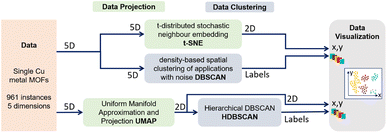 | ||
| Fig. 2 Two pipelines used for clustering and data visualization: (t-SNE//DBSCAN) DBSCAN clustering of the 5D data and independent t-SNE projection of these clusters in 2D space following the process used by Roter et al.51 (top); (UMAP → HDBSCAN) UMAP projection of the 5D data in 2D space, then HDBSCAN clustering of the 2D embedded data following the process used by Baird et al.12 (bottom). | ||
| Σk = λkDkAkDtk |
Fourteen possible models are available in MCLUST57 and displayed in Fig. 3. A subset is detailed in Table 1.
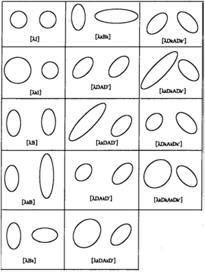 | ||
| Fig. 3 The fourteen MCLUST GMM models. For two groups in two dimensions, this graphic displays the typical ellipse of constant density per group for each of the several models proposed by EDDA. Courtesy of Bensmail et al. (1996).58 | ||
| Model | EM | Dist | Vol | Shape | Orient |
|---|---|---|---|---|---|
| λI | • | Spherical | Equal | Equal | NA |
| λ k I | • | Spherical | Variable | Equal | NA |
| λDAD t | • | Ellipsoidal | Equal | Equal | Equal |
| λ k DAD t | • | Ellipsoidal | Variable | Equal | Equal |
| λD k AD t k | • | Ellipsoidal | Equal | Equal | Variable |
| λ k D k AD t k | • | Ellipsoidal | Variable | Equal | Variable |
| λ k D k A k D t k | • | Ellipsoidal | Variable | Variable | Variable |
The Bayesian information criterion (BIC)59 can be used to select automatically the optimal number of clusters and the best covariance structure (EDDA) of their components.
2.3 Proposed approach
Different processes exist to cluster data, based on their visualization,50 for instance by clustering the data in their original space then visualizing the results with a projection technique (t-SNE//DBSCAN) (Fig. 2 (top)) or by projecting the data in a low dimension first, then clustering the resulting projection (UMAP → HDBSCAN) (Fig. 2 (bottom)). In both cases, the analyst relies on visual validation of the resulting clusters, a standard visual analytic task known as Matching Clusters and Classes.60 A good matching between cluster patterns (point aggregates) and color-coded classes is a sign of a good clustering.Unfortunately, both approaches suffer from distortions of the projection technique due to the reduction of the dimensionality.24 For instance, PCA does not allow the discovery of clusters with non-convex shapes or non-linear separation structures. Separated clusters in the data can appear to be overlapping and indistinguishable in PCA plots.30 In contrast, t-SNE and UMAP are more likely to shatter clusters in separate components.32 Thus, the clusters we can see in t-SNE or UMAP embeddings are not trustworthy.25,26 Moreover, these embeddings suffer from a lack of reproducibility61 due to the stochastic and non-convex nature of their optimization process. Recent work proposes projection techniques29 and quality measures,26 which help mitigate these issues, but they cannot be entirely avoided. Although DBSCAN and HDBSCAN are deterministic clustering methods, their results strongly depend on the choice of their parameters. For these reasons, the use of t-SNE//DBSCAN51 and UMAP → HDBSCAN12 for clustering is not reliable for discovering actual clusters in the data space (Fig. 6).
In contrast, GMM directly extracts clusters in the multidimensional data space and gives insight into the local covariance structure of the clusters in that space. It is stable across multiple runs and uses a grounded model selection process to determine the best number of clusters. However, when the clusters do not follow Gaussian distributions, GMM may partition these clusters into several overlapping Gaussian components. Interpreting the GMM result then becomes challenging.
We propose to complement the GMM clustering with a visualization step to support the clustering decision of the analyst. Our approach is summarized in Fig. 4.
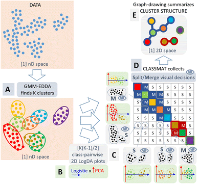 | ||
| Fig. 4 Our methodology follows five steps: (A) clustering of the data with GMM-EDDA in n-dimensional data space; (B) projection of each of the K(K − 1)/2 pairs of clusters independently using logistic regression and PCA forming “LogDA” scatterplots; (C) visual inspection of these LogDA plots without color-coded classes by the end-user to decide about the cluster overlap (the two classes could be merged) or separation (the two classes could remain split); (D) collection of the merge (M) or split (S) decisions into a ClassMat62 adjacency matrix; (E) representation of the cluster structure as a node-link diagram. All processes are automatic except the crucial visual decision step (C). | ||
As already mentioned, there is no global projection that would provide a trustworthy overview of the topology of data clusters.24,61 However, if we consider each pair of Gaussian clusters found by the GMM, we can apply a local linear projection to visualize the data they represent and decide how they are separated or overlap in the data space. Then, we can reconstruct the overall topology of the clusters by aggregating these pairwise decisions. In contrast to automatic decision methods,63 the pairwise visualization allows the analyst to take ownership and responsibility of the clustering process. The decision for each pair of GMM clusters is objective and can be discussed between several analysts to reach a consensus.
Finally, our methodology is as follows: we first cluster the data using GMM-EDDA (Fig. 4A). For each pair of GMM clusters, we consider each cluster of the pair to form a distinct class of data, and we apply the logistic regression model64 to separate them. This model provides a probabilistic output indicating the probability for a data point to belong to either one of the clusters. We use the decision axis of the logistic regression as the first visualization axis, and we use the first principal component in the subspace orthogonal to the logistic axis as the second visualization axis. As a result, we get a scatterplot that we call a plot, where the pair of GMM clusters tend to be maximally separated along the logistic x-axis, and maximally spread along the PCA y-axis (Fig. 4B).
We gather all pairs of LogDA plots into a class-wise pairplot called ClassMat62(see Fig. 4C and 7), to give the analyst an overview of the visual clustering process. ClassMat is similar to a pairplot but focused on classes instead of dimensions.
For each LogDA plot, the analyst can decide visually if two classes (GMM clusters) are separated enough to form valid clusters, or if they should be merged to form a single cluster instead. In contrast to other projection techniques like t-SNE or UMAP, if two classes appear separated in a LogDA plot, they must also be separated in the data space: visual class separation is trustworthy. The analyst can trust the class separation in these plots and infer the overall cluster structure in the data space by collecting all pairwise decisions from each LogDA plot (Fig. 4C). The decisions gathered in ClassMat (Fig. 4D) form an adjacency matrix of a graph connecting or not the components of the GMM. This graph is summarized visually as a node-link diagram (Fig. 4E) to understand the overall data cluster structure.
This work employs logistic regression to minimize the probability of overlap between clusters. It is worth mentioning some limitations related to the fact that we consider linear separation between clusters only, so we may merge two clusters if they are not linearly separable enough. However, because we are considering clusters from a Gaussian mixture model, the clusters are Gaussians hence they are naturally convex (ellipsoids), and they become non-convex only when two clusters overlap (one dense Gaussian distribution inside the area of a larger less dense Gaussian distribution for instance).
3 Results
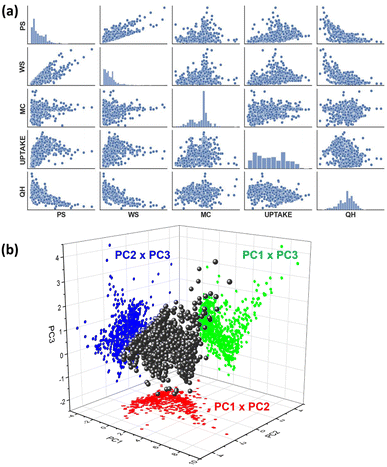
A top-down approach was followed to shortlist the MOF material candidates and use them as a test case in developing a clustering methodology. 961 single Cu metal containing MOFs were identified in the CoreMOF database and used in the current studies. Five features: pore size (Å), window size (Å), metal charge (e), CO2 uptake (mmol g−1), and CO2 heat of adsorption (kJ mol−1), were calculated for each MOF as we believed these features would be adequate to describe the topological, electronic and adsorption properties of the material. All the calculations to produce the features are discussed in Section 2.1. A dataset was generated based on the CO2 absorptive pressures at 10 bar (Cu-MOF-10 bar). Due to MOF materials' primary application relying on the adsorption properties, we analysed their data at high (10 bar) pressure. Once we built a dataset, the next step consists of analyzing the patterns, relationships, or anomalies. As a starting point, we executed one of the well-known tools, the pairs plot (also called a scatterplot matrix), which allows for finding both distributions of single features and relationships between two features. Fortunately, this method is easily implemented in Python using the seaborn visualization library.65 The pair plots of the Cu-MOF-10 bar dataset are shown in Fig. 5a. We found no distinguishable group of data points during pair-wise visual inspection.Further, we applied a dimensionality reduction algorithm to capture significant multi-dimensional data structures. In this regard, we tried the favoured method, principal component analysis (PCA),66 that can be fed raw data and is independent of prior data labels. The basic principle of PCA is described in Section 2.2.1. The generated principal components (PCs) are ordered by their decreasing eigenvalues. The top three principal components are used to display the Cu-MOF-10 bar dataset in Fig. 5b.
Three principal components were calculated for Cu-MOF-10 bar data that have total variance explained in the following percentages: PC1: 57.09%, PC2: 21.18%, and PC3: 12.14%. To get a clear visualization of the 3D plot, we added the projections along XY (PC1 × PC2), YZ (PC2 × PC3), and XZ (PC1 × PC3) axes. None of the projections portrays any separation of the data into clusters. Hence, we extended our studies to use a non-linear dimensionality reduction method, t-SNE and UMAP in combination with DBSCAN and HDBSCAN clustering methods12,51 (Fig. 2), which are more likely to help discover clusters in the data. The t-SNE//DBSCAN and UMAP → HDBSCAN methods' implementation details are described in Section 2.2.2. Firstly, our Cu-MOF-10 bar dataset with five features was supplied to t-SNE and UMAP algorithms for 2D embedding. Later, the data clusters were computed in the original input data space using DBSCAN and in the embedded data using HDBSCAN. Scikit-learn and Bioinfokit machine-learning Python libraries were used for t-SNE,67 UMAP,68 DBSCAN,69 and HDBSCAN70 implementations. The 2D view plots using the spatial coordinates either from input features or from the embedded data, and the clustered data of our Cu-MOF-10 bar dataset are shown in 6a–h. Left-side and right-side columns include the outcomes of t-SNE//DBSCAN and UMAP → HDBSCAN procedures that are shown in Fig. 6a–d and e–h, respectively. We started with the parameters mentioned in the developer webpage12,71 to get t-SNE and UMAP 2D embeddings. And we use the default parameters for DBSCAN and HDBSCAN given in the off-the-shelf Scikit-learn webpage.67,71 These methods were repeated twice to check their reproducibility. Fig. 6a, b and e, f show the resulting data clusters. We observe that all four trials produced different numbers of clusters (colors) with various shapes. This demonstrates that the t-SNE//DBSCAN and UMAP → HDBSCAN methodologies lack reproducibility and stability. They can be trapped in the local minima of the embedding process. In addition, we tried to find better parameter values for both the embedding and the clustering techniques, but it led to completely different clusters, as shown in Fig. 6b–d and f–h, demonstrating the sensitivity of these approaches to their parameterization.
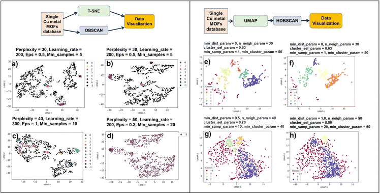 | ||
| Fig. 6 Parameter tuning of existing clustering pipelines from Fig. 2 is challenging. All plots show the same Cu-MOF-10 bar data either clustered with DBSCAN and projected with t-SNE (left column), or projected with UMAP then clustered with HDBSCAN (right column). Projections provide the position of the points and clustering give their color (black or purple (−1) codes for (H)DBSCAN outliers). We run several times the Scikit-learn and Bioinfokit default parameters of t-SNE and DBSCAN (a, b) and UMAP and HDBSCAN (e, f). The stochastic nature of t-SNE and UMAP leads to high variability of the projections; it prevents reproducibility and hinders an objective analysis. When trying to optimize the parameters (c, d) and (g, h), the results remain highly sensitive to the chosen parameters. In (a–d), clustering performed in the data space may be correct but it does not match with cluster patterns generated by the non-trustworthy projections, confusing the analyst. In (e–h), there is a better match between clusters (proximity patterns) and class labels (colors) because clustering occurs in the projection space itself. However, we cannot confirm whether the cluster patterns generated by the projection are trustworthy or not; this time the good visual matching of clusters and classes is misleading. Finally, these two pipelines are sensitive to parameters and not trustworthy due to the distortions of the projection techniques. These observations confirm the same misleading or deceptive results when using such projection and clustering techniques in the domain of single-cell genomics.61 | ||
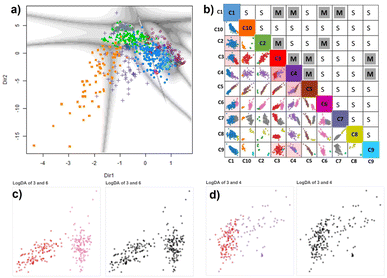 | ||
| Fig. 7 (a) Cu-MOF-10 bar dataset projected onto the first two principal directions of the GMM-EDDA model showing the decision boundaries with uncertainties. (b) ClassMat62 gives an overview of the two-dimensional LogDA plots displayed for each pair of classes obtained from the GMM-EDDA model. Colors code for the GMM clusters. For instance, the LogDA plot with red and pink points at the crossing of column C3 and row C6 shows that classes C3 (red) and C6 (pink) form distinct clusters in that linear projection (c), from which we conclude C3 and C6 are well separated forming distinct clusters in the data space as well. For that reason, the split (S) decision has been marked by the analyst in the cell at the crossing of row C3 and column C6. In contrast, classes C3 and C4 overlap forming a single cluster clearly visible from the monochrome version of the LogDA plot (d), leading to a merge (M) decision marked in the cell at the crossing of row C3 and column C4. The remaining LogDA plots and decisions are given in the ESI.† | ||
At this stage, it seemed that despite all these different approaches, our Cu-MOF-10 bar data do not seem to form distinct clusters in the five-dimensional feature space.
3.1 Applying our divide-and-conquer human-in-the-loop methodology
We now use the proposed methodology (see Section 2.3). We use the MCLUST package with EDDA option to fit a finite Gaussian-Mixture Model (Section 2.2.3) (MclustDr) with the Bayesian information criterion (BIC) to select the optimal number of clusters and covariance structure of its components (Fig. 4A). Five features: pore size (PS), window size (WS), metal charge (MC), uptake-CO2 (UPTAKE), and CO2 heat of adsorption (QH), were considered to visually cluster the Cu-MOF-10 bar dataset with a GMM. We ran ten GMM models with their own random seed to vary the initial values of the estimated parameters. We collected the optimal BIC for each of them and selected the GMM model with the best BIC over all 10 trials as the final model. Notice that each GMM runs its own internal BIC-based optimization cycle to select the best covariance model (EDDA, Fig. 3) and number K of Gaussian components among {1, …, 15}.We obtained ten clusters in the final BIC-optimal GMM-EDDA shown using a linear projection in Fig. 7a. The grey boundaries represent the cluster uncertainties. As it is a linear projection of all the data, we cannot infer the cluster structure from this single plot24 where most clusters seem to overlap.
We apply the logistics-based discriminant analysis and PCA for each pair of GMM-EDDA clusters (Fig. 4B) to find the actual separation between the clusters. We arrange all these LogDA scatterplots into a matrix called ClassMat62 (Fig. 4C).
The ten GMM-EDDA clusters (Fig. 7a) result in 45 LogDA projections displayed in Fig. 7b as scatter plots arranged in the lower triangular part of the ClassMat matrix. The individual clusters in each LogDA plot are shown in a distinctive color to ease visual analysis (see Fig. S1–S5†). As per Fig. 7b and S1–S5,† the next step is for the end-user to visually decide the clusters' separation in each LogDA plot. In order not to be biased by the color of the GMM clusters in LogDA plots, we plotted them in black-and-white. Two of these plots are shown adjacent to their colored counterpart in Fig. 7c and d (all of them in Fig. S1–S5†).
All 45 pairwise LogDA monochrome plots were analysed visually to analyze the presence of cluster separation leading to a split decision (e.g. (C3, C6) pairs in Fig. 7c) or cluster overlap leading to a merge decision (e.g. (C3, C4) pair in Fig. 7d). The analyst considered some pairs of clusters to be separated based on the difference in density rather than the wide empty space between them (e.g. C6 and C7 in Fig. S4†). The cluster pairs that are displayed in the lower triangular part of the ClassMat in Fig. 7b were marked in the upper triangular part of ClassMat as ‘M’ or ‘S’ for merge or split decisions, respectively.
The ensemble of merge or split decisions gathered in ClassMat form an adjacency matrix of a graph connecting the 10 initial GMM clusters (M code for the presence of a link and S for its absence). The connected components of this graph form the meta-clusters of our data. Further, we computed the node-link representation of this graph shown in Fig. 8 using the Pyvis Python interface.72
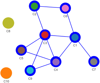 | ||
| Fig. 8 The decisions recorded in ClassMat (Fig. 7b) form an adjacency matrix where M stands for a link between two GMM-EDDA components and S for no such link. A node-link diagram is used to represent these adjacency data. It summarizes the visual decisions of the analyst in an easy-to-read network whose connected components form meta-clusters: a large cluster made of GMM-EDDA components C1–C2–C3–C4–C5–C6–C7–C9 and two isolated components C8 and C10. | ||
Finally we discovered three meta-clusters in our data, visible as the three connected components of this graph: CA = (C1, C2, C3, C4, C5, C6, C7, C9) (blue), and the isolated GMM clusters C8 (gold) and C10 (orange). The node-link diagram also suggests the possible existence of some branching structures (C5, C7, C9) and a cycle (C1–C3–C2–C6) within these data that could be investigated further in future work.
The pairwise LogDA projections of the aggregated clusters and the individual clusters are shown in Fig. 9a–c.
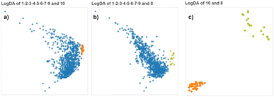 | ||
| Fig. 9 (a–c) LogDA projections of the three pairs of final clusters discovered. Although C8 and C10 are clearly separated from each other, it would have been difficult to distinguish them from the cluster CA but the LogDA plots between C8 or C10 and any of the components of CA show that they form distinct clusters (ESI†). | ||
The LogLDA plots of CA-C8 and CA-C10 (Fig. 9a and b) show these pairs are not linearly separated (a black-and-white version of these plots would not let us discover the two clusters). But we know that every pair formed by a component of CA and either C8 or C10 shows well separated clusters (Fig. 7b and S1–S5†) which indicates C8 and C10 are possibly nested into CA or at least non-linearly separable from it. This is a case similar to the illustrative example (Fig. 4A) where no linear projection can separate the two composite clusters (gold-green) and (red-grass-yellow-brown-blue), but every pair of components taking one component from each composite cluster is linearly separable. Thanks to our divide-and-conquer methodology we can discover complex clusters using multiple class-pairwise linear projections.
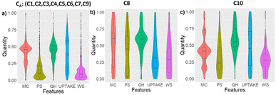
We characterize the resulting aggregated clusters individually by computing the distribution of their data along the five different features (Violin plots in Fig. 10) and computing their correlation coefficient between every pair of features (Heatmaps in Fig. 11).
3.2 Violin plots of the data distribution
To acquire more confidence in the separation between the clusters obtained from the GMM-EDDA and LogDA hybrid methodology, we calculated violin plots that visually represent the entire data distribution in the three clusters. The data corresponding to each feature were normalised. The normalised data of five features in the three clusters (C1, C2, C3, C4, C5, C6, C7, C9), C8, and C10 are used to generate violin plots, as shown in Fig. 10a–c, respectively.Visually, all three clusters, CA, C8 and C10 show different violin plot distributions along each feature. The below tendencies are given with respect to the normalized values. The data from the cluster CA are well concentrated along medium MC and QH, and low PS and WS nv, but are not very dependent on UPTAKE. The data from C8 are mostly determined by their concentration on medium QH, and low UPTAKE and WS. Lastly, cluster C10 gathered data with medium MC, high QH, and low PS and WS, with not much dependency on UPTAKE. These characteristics further validate the singularity and distinctiveness of the clusters discovered with our methodology.
3.3 Heatmap representation of correlation coefficients
Pearson correlation coefficients were calculated among the features for each cluster and represented as a heatmap in Fig. 11. QH, PS, and WS are strongly correlated in all meta-clusters, but WS and MC are strongly correlated in C8 in contrast to C10 and CA, while MC and UPTAKE are more correlated in CA than in C8 or C10, and MC is the least correlated to any other feature in C10 compared to C8 or CA. Again, the three clusters show distinct correlation patterns indicating different global orientations in the data space and confirming their singularity.4 Limitations and future work
Our proposed method employs logistic regression to minimize the probability of overlap between clusters in the embedding space. We could have used the standard Fisher Discriminant analysis (LDA)73 as an alternative for the first axis, but LDA attempts to maximize between-class separation while minimizing within-class variance, assuming Gaussian distribution of the classes. Gaussian Mixture Models also assume the data are generated by a mixture of Gaussian distributions, but the actual distribution of the data finally encoded by each GMM component is not necessarily Gaussian especially after assigning data to the most likely of several overlapping Gaussian components to decide their class. In contrast, the proposed logistic regression is less sensitive to the possible non-Gaussianity of each class and does not attempt to minimize the within-class variance, focusing its resources on maximizing the between-class separation.If two clusters appear separated along the LogDA axis, they must be separated in the original data space too. However, the converse may be false: two nonlinearly separated clusters may appear as overlapping in the LogDA plot, leading to a merge decision, for example, two interlocked banana-shaped clusters or a narrow Gaussian cluster nested into a spherical-shell cluster. Still, as we consider clusters from a Gaussian mixture model which is essentially a density model, we assume the GMM components are automatically captured nearly Gaussian clusters or they cover a continuous region of the data distribution forming a single data cluster, hence they are likely convex (ellipsoids) or at least simply connected (not in multiple parts and with no hole). As a result, in the meta-cluster network representation (Fig. 4E and 8), the absent links are the most trustworthy and can be checked visually in the corresponding LogDA plots, while some clusters (nodes) might need to be split further, and some links might not exist in the actual data. If our assumption is not valid, refined analysis tools like topological data analysis techniques62,63 could be used to complement this pipeline.
Other clustering techniques such as DBSCAN, HDBSCAN, or the well-known K-means74 could be used instead of GMM. However DBSCAN or HDBSCAN would not be good candidates as they can form non-convex clusters which would not verify our base assumption for interpreting LogDA plots for split and merge decisions. K means instead would verify the convexity assumption as it partitions the data into K Voronoi cells. However, in contrast to K means, the GMM benefits from a well-grounded statistical framework75 equipped with Bayesian criteria to select the number of clusters. Moreover, it has been shown that K means is a special case of GMM if we use a hard class assignment between the Expectation and Maximization (EM) steps of the GMM optimization process.76 As an exercise, though, we ran our methodology using K means with K set to 10 as found by the optimal GMM. Results are displayed in ESI Fig. S6 and S7.†
The GMM model plays a central role in our approach. The number of parameters to estimate grows linearly with the number of components K (means and prior weights) and quadratically with the dimension n (covariance matrix). Thus, the main technical limitation is the data sample size as we expect at least a few data values to estimate each parameter, and the data dimension n as covariance matrices can become numerically unstable. In practice, the Mclust toolbox can handle data with size up to ∼10![[thin space (1/6-em)]](https://www.rsc.org/images/entities/char_2009.gif) 000 and dimensions up to ∼20. Data random subsampling and PCA are usually applied to reduce the data size and dimension to technically manageable values without loosing much information. Otherwise, scalable approaches have been proposed for training GMM.77,78 We considered a continuous feature space, but ordinal and categorical features can also be handled with variants of GMM75 and would also require some adaptation of the LogDA plots in our method. They are left as future work.
000 and dimensions up to ∼20. Data random subsampling and PCA are usually applied to reduce the data size and dimension to technically manageable values without loosing much information. Otherwise, scalable approaches have been proposed for training GMM.77,78 We considered a continuous feature space, but ordinal and categorical features can also be handled with variants of GMM75 and would also require some adaptation of the LogDA plots in our method. They are left as future work.
Our experiments showed that t-SNE//DBSCAN and UMAP → HDBSCAN clustering pipelines (Fig. 6) are sensitive to parameter settings. This indicates that developing an optimization workflow to optimize the hyperparameters for t-SNE, UMAP, DBSCAN, and HDBSCAN methods is a worthy future work.
Our method involves visual checking of possibly many scatterplots. There are perceptual limitations in terms of the size of the ClassMat visualization to render more than about 20 clusters (20 × 20 matrix of scatterplots) on a standard screen display. Several features could enhance our approach and are left as future work: allowing for interactive exploration of ClassMat using pan and zoom; using ClassMat directly to annotate interactively the split-or-merge decisions; re-ordering rows and columns automatically based on these decisions so meta-clusters appear as blocks along the diagonal as in Fig. 4D; or using indicators of visual quality measures31,79–82 or clustering indices21 to explore in priority the scatterplots with the most ambiguous cluster patterns.
Clustering indices21 could be used to quantify cluster patterns in LogDA plots, and the resulting meta-cluster. However, it is important to note that clustering quality metrics are designed to compare alternative clusterings of the same set of points, so they cannot be used to compare patterns from two different LogDA plots, although research is ongoing in that direction.83 Moreover, they cannot output a value if there are less than two clusters. As a result, it is not possible to use such a score to decide if two clusters should remain split or merged into one as no score is available in that latter case.
Finally, our proposal emphasizes the importance of human-in-the-loop decisions in clustering. Clustering techniques and clustering quality metrics21 are both a form of human knowledge embedded in a computational function, except they are predefined and generic, while our approach lets the end-user decide for each pair of clusters based on a wide range of possible visual patterns. We argue that letting the end-user decide by visual analysis of carefully chosen two-dimensional linear projections of cluster pairs can be used to improve the base clustering technique to detect non-linear and more complex cluster topologies, and engage the end-user in the decision. The meta-clusters obtained by aggregating base clusters come as complementary insights of the cluster structure that the base clusters could not reveal alone (Fig. 4E). Moreover, the individual decisions can still be discussed between several experts visualizing the same data (the LogDA plots), to come to a consensus decision if needed. This makes our method a novel form of interpretable clustering84,85 instead of a black-box clustering model the end-user must trust blindly. Still, a future study with multiple end-users and various datasets will be run to validate our method more quantitatively.
5 Conclusion
This work proposes a protocol of data clustering and visualization methodologies to obtain the clusters from a highly overlapped dataset. A MOF materials database, the CoREMOF database with five features that reflect topological (pore size, window size), electronic (metal charge), and CO2 adsorption properties (amount of adsorption, heat of adsorption) at 10 bar pressure, was considered as a test case for our methodology. Among conventional data projection methods, PCA did not discover any clusters. Later, the well-known data projection methods like UMAP and tSNE, combined with DBSCAN and HDBSCAN clustering techniques, highlighted the overlapping nature of our dataset but lacked reproducibility even when using the same hyperparameters. Hence, we proposed to use model-based clustering, which uses Gaussian mixture models (GMM) with the EDDA method for clustering the data. The GMM-EDDA method separated the data into ten overlapping clusters upon 2D projection visualization. We enriched the GMM-EDDA cluster results with all class-pairwise LogDA plots forming ClassMat. Our divide-and-conquer methodology relies on a human-in-the-loop approach for inner clustering decisions; this involvement should empower the analyst and induce more confidence in the clustering result compared to fully automatic but not trustworthy pipelines with blind parameter tuning. Furthermore, each pairwise decision is supported by a LogDA visualization so it can be discussed among several analysts in order for them to come to a consensus on what should constitute a valid cluster. At least the clustering process can be checked and discussed among experts through the class-pairwise LogDA trustworthy visual representations of high-dimensional data.Regarding complex overlapped MOF data, the use of this methodology allowed us to discover three clusters with non-linear separation in the data space. We could characterize these clusters by their correlation and distribution among the five features. This work demonstrates that MOF materials can have highly correlated properties and cannot be categorized based on knowing only geometrical or electronic descriptors using standard clustering and projection pipelines. Our future aim is to classify the MOF materials based on the topological and electronic descriptors using the current clustering methodology as a starting step. The present method could also be applied to any virtual dataset beyond materials science.
The methodology itself could benefit from using indicators to support the analyst in examining the challenging LogDA plot in priority, while some others with obvious class separation could be decided automatically. Developing a fully interactive tool to record the analyst's decision and draw the corresponding node-link diagram would also be a plus. Supporting the analysis of branching structures and cycles formed by the resulting graph is also of interest.
Data availability
The source code for data preparation, model implementation, training, and evaluation is available at https://github.com/elfedwa/Visual-Clustering-of-Overlapping-Materials-Science-Data.git.Conflicts of interest
There are no conflicts to declare.Acknowledgements
Qatar National Research Fund, QNRF NPRP12C-33923-SP-101, financially supports this work. The authors thank QEERI at Hamad Bin Khalifa University for providing HPC resources. We thank Dr Chris Fraley for her valuable suggestions.References
- M. Ding, R. W. Flaig, H.-L. Jiang and O. M. Yaghi, Chem. Soc. Rev., 2019, 48, 2783–2828 RSC.
- K. Zu, M. Qin and S. Cui, Renewable Sustainable Energy Rev., 2020, 133, 110246 CrossRef CAS.
- I. Thomas-Hillman, A. Laybourn, C. Dodds and S. W. Kingman, J. Mater. Chem. A, 2018, 6, 11564–11581 RSC.
- A. Karmakar, V. Prabakaran, D. Zhao and K. J. Chua, Appl. Energy, 2020, 269, 115070 CrossRef CAS.
- M. A. Tahir, N. Arshad and M. Akram, J. Energy Storage, 2022, 47, 103530 CrossRef.
- A. E. Baumann, D. A. Burns, B. Liu and V. S. Thoi, Commun. Chem., 2019, 2, 1–14 CrossRef.
- C. R. Groom, I. J. Bruno, M. P. Lightfoot and S. C. Ward, Acta Crystallogr., Sect. B, 2016, 72, 171–179 CrossRef CAS PubMed.
- C. E. Wilmer, M. Leaf, C. Y. Lee, O. K. Farha, B. G. Hauser, J. T. Hupp and R. Q. Snurr, Nat. Chem., 2012, 4, 83–89 CrossRef CAS PubMed.
- D. A. Gómez-Gualdrón, Y. J. Colón, X. Zhang, T. C. Wang, Y.-S. Chen, J. T. Hupp, T. Yildirim, O. K. Farha, J. Zhang and R. Q. Snurr, Energy Environ. Sci., 2016, 9, 3279–3289 RSC.
- P. G. Boyd and T. K. Woo, CrystEngComm, 2016, 18, 3777–3792 RSC.
- D. Xu and Y. Tian, Ann. Data Sci., 2015, 2, 165–193 CrossRef.
- S. G. Baird, T. Q. Diep and T. D. Sparks, Digital Discovery, 2022, 1, 226–240 RSC.
- C. J. Hargreaves, M. S. Dyer, M. W. Gaultois, V. A. Kurlin and M. J. Rosseinsky, Chem. Mater., 2020, 32, 10610–10620 CrossRef CAS.
- L. McInnes, J. Healy and J. Melville, UMAP: uniform manifold approximation and projection for dimension reduction, arXiv, 2018, preprint, arXiv:1802.03426, DOI:10.48550/arXiv.1802.03426.
- L. van der Maaten and G. Hinton, J. Mach. Learn. Res., 2008, 9, 2579–2605 Search PubMed.
- A. Y.-T. Wang, S. K. Kauwe, R. J. Murdock and T. D. Sparks, npj Comput. Mater., 2021, 7, 1–10 CrossRef.
- T. C. Nicholas, A. L. Goodwin and V. L. Deringer, Chem. Sci., 2020, 11, 12580 RSC.
- S. M. Moosavi, A. Nandy, K. M. Jablonka, D. Ongari, J. P. Janet, P. G. Boyd, Y. Lee, B. Smit and H. J. Kulik, Nat. Commun., 2020, 11, 1–10 RSC.
- S. Majumdar, S. M. Moosavi, K. M. Jablonka, D. Ongari and B. Smit, ACS Appl. Mater. Interfaces, 2021, 13, 61004–61014 CrossRef CAS PubMed.
- A. Breger, C. Karner and M. Ehler, Pattern Recognit., 2024, 148, 110136 CrossRef.
- Y. Liu, Z. Li, H. Xiong, X. Gao and J. Wu, 2010 IEEE International Conference on Data Mining, 2010, pp. 911–916 Search PubMed.
- P. J. Rousseeuw, J. Comput. Appl. Math., 1987, 20, 53–65 CrossRef.
- T. Caliński and J. Harabasz, Commun. Stat., 1974, 3, 1–27 Search PubMed.
- L. G. Nonato and M. Aupetit, IEEE Trans. Visualization Comput. Graphics, 2019, 25, 2650–2673 Search PubMed.
- M. Aupetit, Proceedings of the Fifth Workshop on Beyond Time and Errors: Novel Evaluation Methods for Visualization, New York, NY, USA, 2014, pp. 134–141 Search PubMed.
- H. Jeon, Y. Kuo, M. Aupetit, K. Ma and J. Seo, Classes are not clusters: improving label-based evaluation of dimensionality reduction, arXiv, 2023, preprint, arXiv:2308.00278, DOI:10.48550/arXiv.2308.00278.
- M. Aupetit, M. Sedlmair, M. M. Abbas, A. Baggag and H. Bensmail, 30th IEEE Visualization Conference, IEEE VIS 2019 – Short Papers, Vancouver, BC, Canada, October 20–25, 2019, 2019, pp. 141–145 Search PubMed.
- Y. Wang, H. Huang, C. Rudin and Y. Shaposhnik, J. Mach. Learn. Res., 2021, 22, 73 Search PubMed.
- B. Colange, J. Peltonen, M. Aupetit, D. Dutykh and S. Lespinats, Advances in Neural Information Processing Systems 33: Annual Conference on Neural Information Processing Systems 2020, NeurIPS 2020, December 6–12, 2020, Virtual, 2020 Search PubMed.
- E. Elhaik, Sci. Rep., 2022, 12, 14683 CrossRef CAS PubMed.
- M. M. Abbas, E. Ullah, A. Baggag, H. Bensmail, M. Sedlmair and M. Aupetit, ClustML: a measure of cluster pattern complexity in scatterplots learnt from human-labeled groupings, arXiv, 2023, preprint, arXiv:2106.00599, DOI:10.48550/arXiv.2106.00599.
- M. Wattenberg, F. Viégas and I. Johnson, How to Use t-SNE Effectively, 2016, https://distill.pub/2016/misread-tsne Search PubMed.
- M. Cavallo and C. Demiralp, IEEE Trans. Visualization Comput. Graphics, 2019, 25, 267–276 Search PubMed.
- P. Bruneau, P. Pinheiro, B. Broeksema and B. Otjacques, Neurocomputing, 2015, 150, 627–644 CrossRef.
- C. R. Groom, I. J. Bruno, M. P. Lightfoot and S. C. Ward, Acta Crystallogr., Sect. B: Struct. Sci., Cryst. Eng. Mater., 2016, 72, 171–179 CrossRef CAS PubMed.
- A. Taher, D. W. Kim and I.-M. Lee, RSC Adv., 2017, 7, 17806–17812 RSC.
- A. R. Bagheri and M. Ghaedi, Arabian J. Chem., 2020, 13, 5218–5228 CrossRef CAS.
- J. H. Jo, H.-C. Kim, S. Huh, Y. Kim and D. N. Lee, Dalton Trans., 2019, 48, 8084–8093 RSC.
- Y. G. Chung, E. Haldoupis, B. J. Bucior, M. Haranczyk, S. Lee, K. D. Vogiatzis, S. Ling, M. Milisavljevic, H. Zhang, J. S. Camp, B. Slater, J. I. Siepmann, D. S. Sholl and R. Q. Snurr, Computation-Ready Experimental Metal–Organic Framework (CoRE MOF) 2019 Dataset, 2020 Search PubMed.
- T. F. Willems, C. H. Rycroft, M. Kazi, J. C. Meza and M. Haranczyk, Microporous Mesoporous Mater., 2012, 149, 134–141 CrossRef CAS.
- D. Dubbeldam, S. Calero, D. E. Ellis and R. Q. Snurr, Mol. Simul., 2016, 42, 81–101 CrossRef CAS.
- A. K. Rappe, C. J. Casewit, K. S. Colwell, W. A. I. Goddard and W. M. Skiff, J. Am. Chem. Soc., 1992, 114, 10024–10035 CrossRef CAS.
- S. L. Mayo, B. D. Olafson and W. A. Goddard, J. Phys. Chem., 1990, 94, 8897–8909 CrossRef CAS.
- A. García-Sánchez, C. O. Ania, J. B. Parra, D. Dubbeldam, T. J. H. Vlugt, R. Krishna and S. Calero, J. Phys. Chem. C, 2009, 113, 8814–8820 CrossRef.
- A. K. Rappe and W. A. I. Goddard, J. Phys. Chem., 1991, 95, 3358–3363 CrossRef CAS.
- C. E. Wilmer and R. Q. Snurr, Chem. Eng. J., 2011, 171, 775–781 CrossRef CAS.
- I. T. Jolliffe and J. Cadima, Philos. Trans. R. Soc., A, 2016, 374, 20150202 CrossRef PubMed.
- sklearn.decomposition.PCA, 2023, https://scikit-learn.org/stable/modules/generated/sklearn.decomposition.PCA.html, [Online, accessed 7. Sep. 2023] Search PubMed.
- M. Balamurali, Encyclopedia of Mathematical Geosciences, Springer, Cham, Switzerland, 2021, pp. 1–9 Search PubMed.
- J. Wenskovitch, I. Crandell, N. Ramakrishnan, L. House, S. Leman and C. North, IEEE Trans. Visualization Comput. Graphics, 2018, 24, 131–141 Search PubMed.
- B. Roter, N. Ninkovic and S. V. Dordevic, Phys. C, 2022, 598, 1354078 CrossRef CAS.
- J. A. Hartigan, Clustering Algorithms, John Wiley & Sons, Inc., Hoboken, NJ, USA, 1975 Search PubMed.
- A. Gordon, Classification, Taylor & Francis, Andover, England, UK, 1999 Search PubMed.
- L. Kaufman and P. J. Rousseeuw, Finding Groups in Data, John Wiley & Sons, Ltd., Chichester, England, UK, 1990 Search PubMed.
- J. D. Banfield and A. E. Raftery, Biometrics, 1993, 49, 803–821 CrossRef.
- H. Bensmail and J. J. Meulman, J. Classif., 2003, 20, 049–076 CrossRef.
- L. Scrucca, M. Fop, T. B. Murphy and A. E. Raftery, R J., 2016, 8, 289–317 CrossRef PubMed.
- H. Bensmail and G. Celeux, J. Am. Stat. Assoc., 1996, 91, 1743–1748 CrossRef.
- G. Schwarz, Ann. Stat., 1978, 6, 461–464 Search PubMed.
- M. Brehmer, M. Sedlmair, S. Ingram and T. Munzner, Proceedings of the ACM BELIV Workshop, 2014, pp. 1–8 Search PubMed.
- T. Chari and L. Pachter, PLoS Comput. Biol., 2023, 19, 1–20 CrossRef PubMed.
- M. Aupetit, A. Ali, A. Baggag and H. Bensmail, 2022 Topological Data Analysis and Visualization (TopoInVis), IEEE, 2022, pp. 70–80 Search PubMed.
- M. Aupetit, Advances in Neural Information Processing Systems 18 [Neural Information Processing Systems, NIPS 2005, December 5–8, 2005, Vancouver, British Columbia, Canada], 2005, pp. 83–90 Search PubMed.
- J. Cramer, Studies in History and Philosophy of Science Part C: Studies in History and Philosophy of Biological and Biomedical Sciences, 2004, vol. 35, pp. 613–626 Search PubMed.
- M. L. Waskom, J. Open Source Softw., 2021, 6, 3021 CrossRef.
- K. Fukunaga, Introduction to Statistical Pattern Recognition, Elsevier, Academic Press, 1990 Search PubMed.
- sklearn.manifold.TSNE, 2023, https://scikit-learn.org/stable/modules/generated/sklearn.manifold.TSNE.html, [Online, accessed 7. Sep. 2023] Search PubMed.
- UMAP: Uniform Manifold Approximation and Projection for Dimension Reduction — umap 0.5 documentation, 2023, https://umap-learn.readthedocs.io/en/latest, [Online, accessed 7. Sep. 2023] Search PubMed.
- sklearn.cluster.DBSCAN, 2023, https://scikit-learn.org/stable/modules/generated/sklearn.cluster.DBSCA.N.html, [Online, accessed 7. Sep. 2023] Search PubMed.
- sklearn.cluster.HDBSCAN, 2023, https://scikit-learn.org/stable/modules/generated/sklearn.cluster.HDBSC.AN.html, [Online, accessed 7. Sep. 2023] Search PubMed.
- sklearn.manifold.TSNE, 2023, https://scikit-learn.org/stable/modules/generated/sklearn.manifold.TSNE.html, [Online, accessed 4. Sep. 2023] Search PubMed.
- Interactive Network Visualizations — pyvis 0.1.3.1 Documentation, 2023, https://pyvis.readthedocs.io/en/latest, [Online, accessed 7. Sep. 2023] Search PubMed.
- T. Sapatinas, J. R. Stat. Soc. Ser. A Stat. Soc., 2005, 168, 635–636 CrossRef.
- J. MacQueen, Proceedings of the Fifth Berkeley Symposium on Mathematical Statistics and Probability, Volume 1: Statistics, University of California Press, Ewing, NJ, USA, 1967, vol. 5.1, pp. 281–298 Search PubMed.
- I. C. Gormley, T. B. Murphy and A. E. Raftery, Annu. Rev. Stat. Appl., 2023, 10, 573–595 CrossRef.
- G. Celeux and G. Govaert, Comput. Statist. Data Anal., 1992, 14, 315–332 CrossRef.
- J. Hyrkas, S. Clayton, F. Ribalet, D. Halperin, E. V. Armbrust and B. Howe, Bioinform, 2016, 32, 417–423 CrossRef CAS PubMed.
- M. Lucic, M. Faulkner, A. Krause and D. Feldman, J. Mach. Learn. Res., 2017, 18, 5885–5909 Search PubMed.
- M. Sedlmair and M. Aupetit, Comput. Graph. Forum, 2015, 34, 201–210 CrossRef.
- M. Aupetit and M. Sedlmair, 2016 IEEE Pacific Visualization Symposium (PacificVis), 2016, pp. 1–8 Search PubMed.
- M. M. Abbas, M. Aupetit, M. Sedlmair and H. Bensmail, Comput. Graph. Forum, 2019, 38, 225–236 CrossRef.
- H. Jeon, G. J. Quadri, H. Lee, P. Rosen, D. A. Szafir and J. Seo, CLAMS: a cluster ambiguity measure for estimating perceptual variability in visual clustering, arXiv, 2023, preprint, arXiv:2308.00284, DOI:10.48550/arXiv.2308.00284.
- H. Jeon, M. Aupetit, D. Shin, A. Cho, S. Park and J. Seo, Sanity check for external clustering validation benchmarks using internal validation measures, arXiv, 2022, preprint, arXiv:2209.10042, DOI:10.48550/arXiv.2209.10042.
- W. K. Tsang and D. F. Benoit, in Interpretability and Explainability in Machine Learning, ed. Y. Ohsawa, Springer International Publishing, Cham, 2023, pp. 89–100 Search PubMed.
- S. Dasgupta, N. Frost, M. Moshkovitz and C. Rashtchian, Proceedings of the 37th International Conference on Machine Learning, 2020 Search PubMed.
Footnotes |
| † Electronic supplementary information (ESI) available. See DOI: https://doi.org/10.1039/d3dd00179b |
| ‡ These authors contributed equally to this work. |
| This journal is © The Royal Society of Chemistry 2024 |


